Repairing a broken text slide and then converting it to a powerful visual
- Apr 26, 2017
- 2 min read
Let’s take a look at a hopeless text slide and repair it. We’ll do it in two phases. First we’ll turn it into a comprehensible text slide and then we’ll convert that slide into a powerful visual.

This slide has 70 words, well above the “40 word rule” recommended on this site. Initially it’s fine to put everything down in long form, but then the text should be edited down so it can be quickly read by the audience, while they simultaneously listen to the speaker.
So let's start with what the author intended…
The title indicates the slide is about the growth and centralization of the Cancer Clinical Trials (CCTO) staff. The first bullet says that in 2009 only 22 staff members reported through the CCTO, but that 50 staff were members of 13 independent departmental teams also conducting cancer clinical trials. The second bullet says that decisions were taken to grow the overall staff and to centralize all staff under the CCTO. The third bullet says that staff in the 13 departmental teams were converted to CCTO employees through attrition, rather than simply transferring them into the CCTO. But the 4th bullet says that staff remaining with their departments would be dual supervised by both CCTO and departmental managers. By 2015 attrition had reduced the number of departmental teams to three with a total of 11 staff. The CCTO meanwhile grew to 166 staff members.
Now let’s turn this into a text slide that can be easily read, and when combined with the speaker’s voice, comprehended.

This slide shows some changes we can make without losing content. There is no need to keep repeating “clinical trials staff,” or “staff.” The title takes care of that. Take off the adjectives, “small,” “total,” etc. Note "new policies" is two words shorter than what it replaced. Economize whenever possible. The slide should contain the core information, which can be embellished by the speaker’s voice.
So let's look at the repaired text slide:

We’ve cut the number of words from 70 to 37, still a bit clunky, but now it's possible for the audience to simultaneously read the slide and listen to the speaker (as he/she points to each bullet and explains what was intended).
Text slides are poor visuals, so when possible, we should always try to visualize text slides. Here is the above text slide in a more visual format.
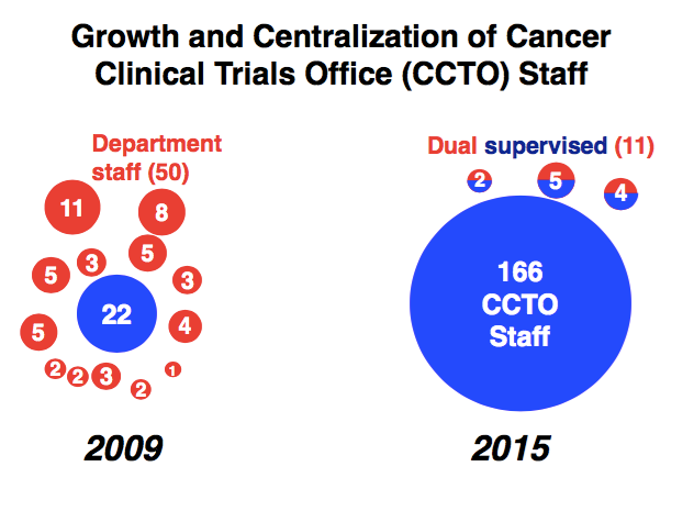
A couple of things to point out. First, color is used to distinguish between CCTO staff and departmental staff. Color is not a decoration but a way to distinguish different kinds of information. The dual supervised staff are colored in a combination of red and blue. Circle areas are sized to reflect the number of staff, providing the audience with an instant recognition of the distribution. The issue of change by “attrition” is not contained on the visual, but that can be addressed by the speaker’s words. Not every last detail needs to go on the slide.
Comments